Log and semilog plots

Last updated:
A good way to plot numerical data that spans a very wide range of values, is to employ a logarithmic scale in one or both axis.
In order to set one or both axes to a log scale, you can employ the argument yaxis=:log10, and/or the corresponding argument xaxis=:log10.
For example, a function that grows very rapidly, like an exponential, can look better on a semilog-y plot:
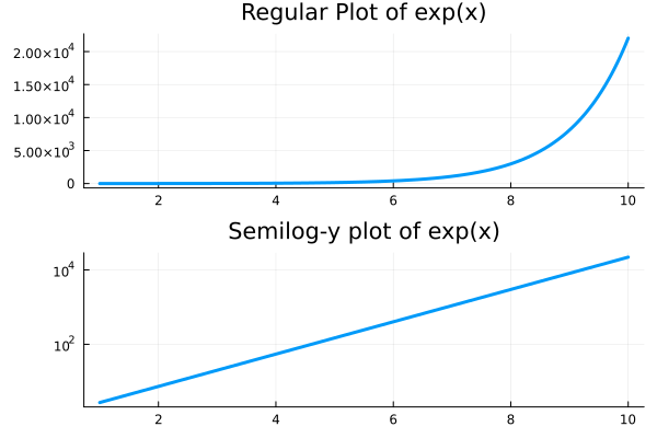
using Plots

f(x) = exp(x)
p1 = plot(f, 1, 10, lw=3,
            title="Regular Plot of exp(x)",
            label=false)

p2 = plot(f, 1, 10,
            yscale=:log10, lw=3,
            title="Semilog-y plot of exp(x)",
            label=false)

plot(p1,p2,layout=(2,1))
While when we want to highling that a function is decaying like a certain power, we can do so with a log-log plot:
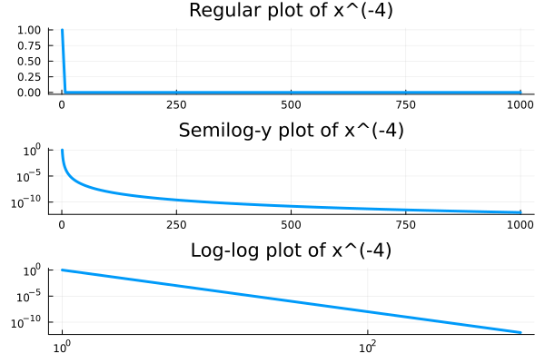
g(x) = 1/x^4
p1 = plot(g, 1, 1000, lw=3,
            title= "Regular plot of x^(-4)",
            label=false)

p2 = plot(g, 1, 1000, lw=3,
            yscale=:log10,
            title="Semilog-y plot of x^(-4)",
            label=false)

p3 = plot(g, 1, 1000, lw=3,
            xscale=:log10,
            yscale=:log10,
            title="Log-log plot of x^(-4)",
            label=false)

plot(p1,p2,p3,layout=(3,1))